Design Trend 2026: Unexpected Pairs
Colour & Pattern Pairings for a More Expressive Bed
Disobey all the rules with interior colour combinations that defy expectation, this Winter pair strange bedfellows to create a memorable and high impact space that oozes personality.
What used to be known as Maximalism has evolved and matured into “Dopamine Home” styling - eclectic colour play designed to spark joy. A sophisticated and curated way of living a life with more colour, more pattern and so much more personality, this trend creates layered and visually rich spaces that provide a sumptuous sense of liveable luxury.
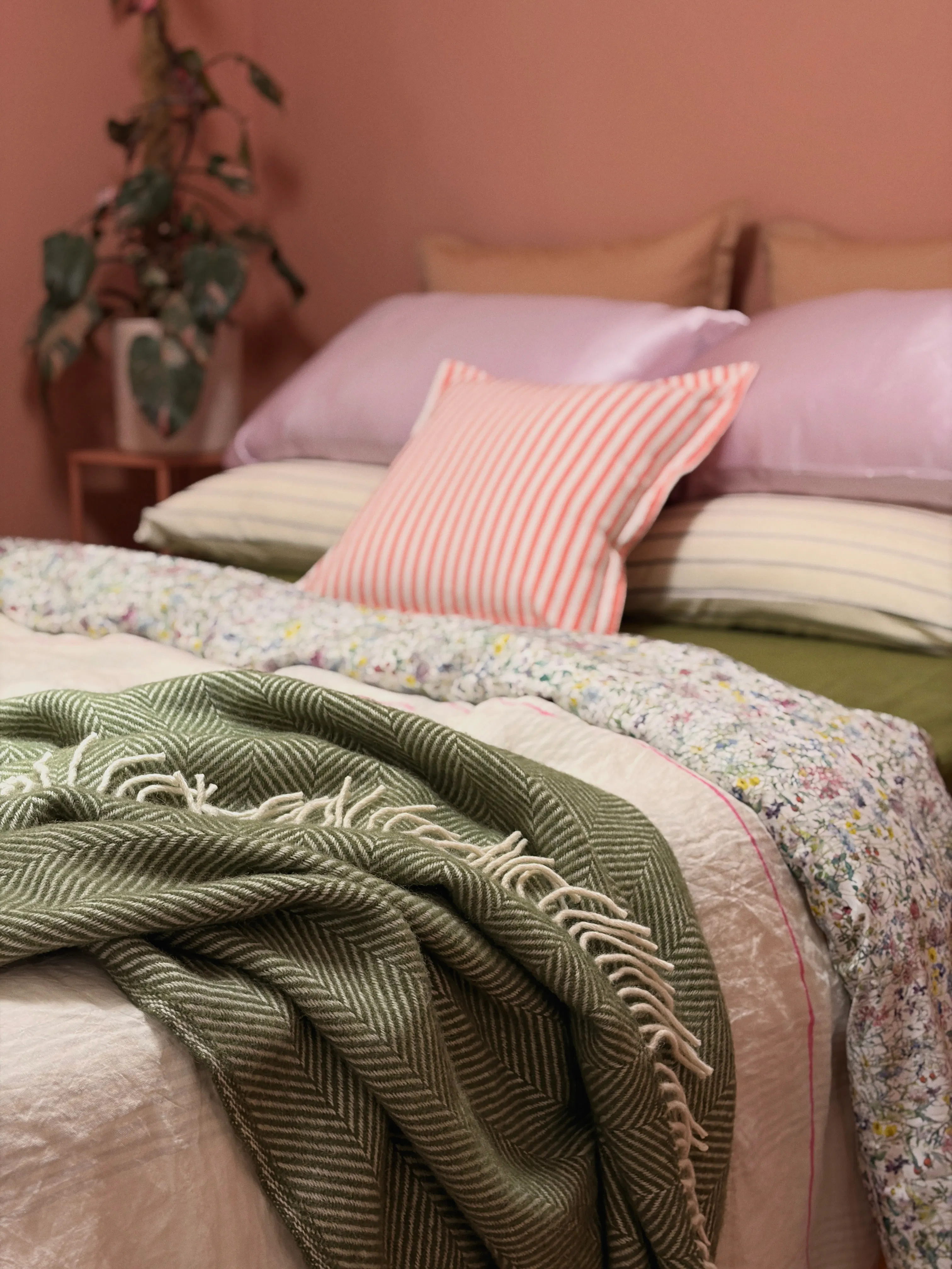
This shift toward unexpected pairings reflects a change in mindset for our approach to decorating homes - one where breaking the rules is encouraged, and creating a space that is playful and uniquely yours is the goal. A survey of industry professionals found that eclecticism and maximalism are edging out client requests for restrained and minimal aesthetics in 2026, and it’s not hard to see the appeal of such visible personality.
Pairing the perfect balance of cool and warm tones adds tension and drama, with thoughtful combinations of textiles, colours and patterns to build a more personalised home. Colour drenched walls, wallpaper, patterned rugs, art and treasured pieces of decor (think your favourite books, treasures found on fondly remembered trips, and lovingly handed down vintage pieces) round out the story.
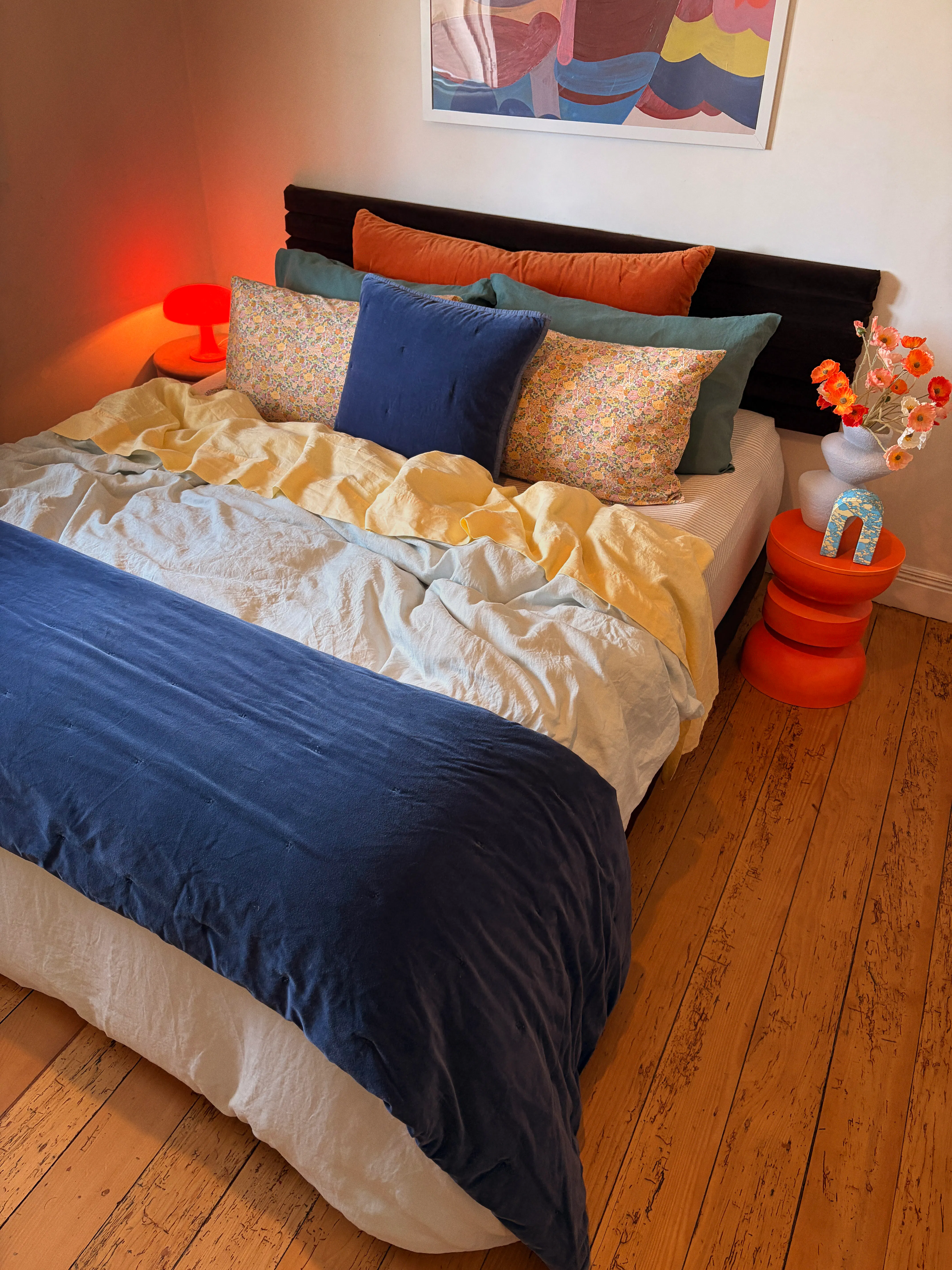
This is a trend with long term liveability, it feels lived-in and is comfortable and practical, but still feels elevated and deeply considered. It’s an expression of a richly textured life and a love letter to our own individuality.
The secret to successful maximalism
Though it may sound intimidating to choose such bold pairings, the secret to successful maximalism lies in balance. Mix textures, patterns, and materials but link everything together through a common palette.
You can use the handy 60-30-10 guide: select one colour you love as the overarching base (60%), a secondary colour for your complement (30%) and a punchy accent colour or neutral (10%) to anchor the overall look.
Curate your space with pockets of joyful colour balanced with more restful areas allowing for a visual break before your eye moves on to discover something new to enjoy!
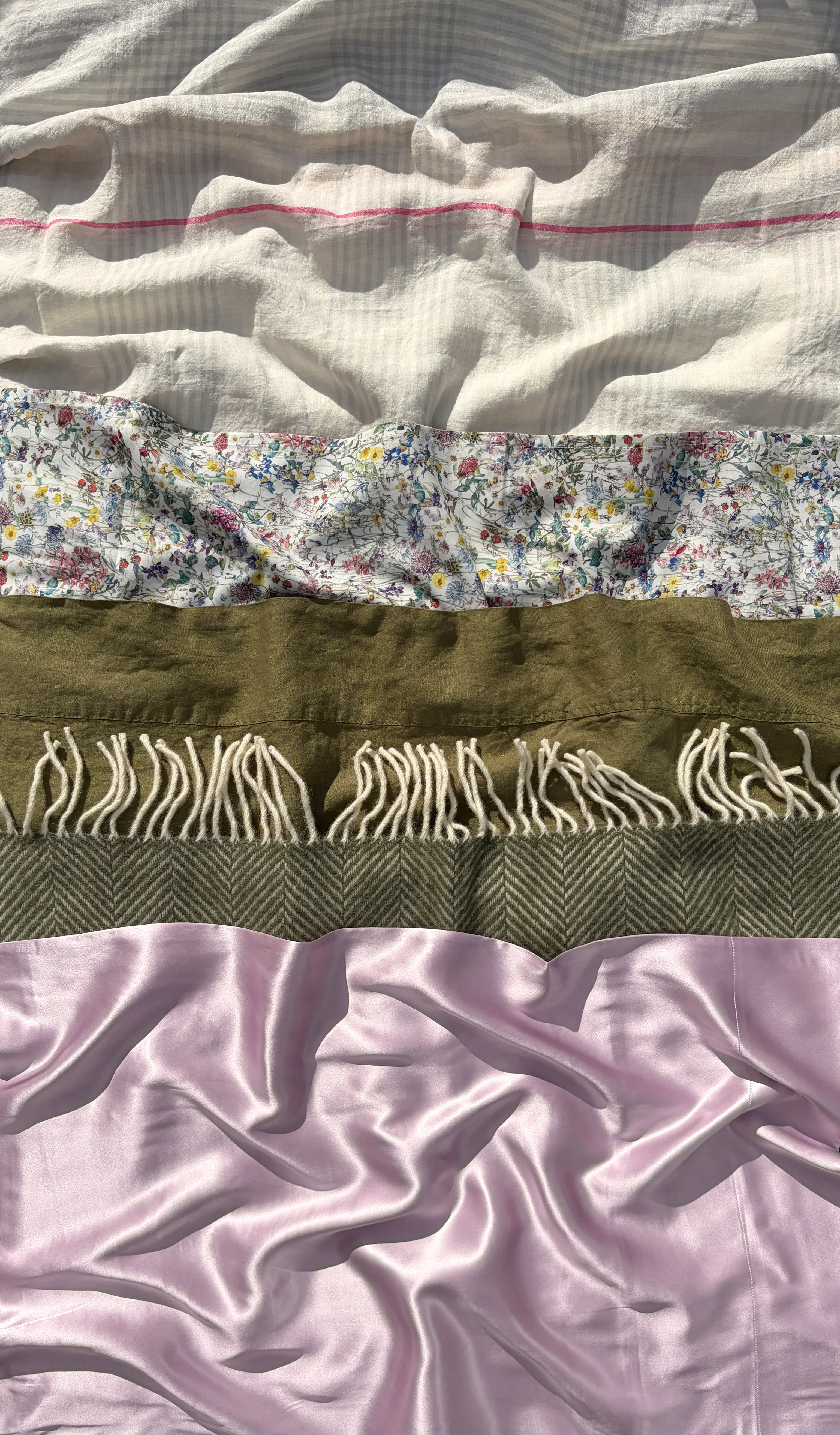
Our favourite “wrong but oh-so-right” combo starts with the grounding white of the Pure Linen Duvet Cover in Maeve with its subtle lilac stripe.
We contrast this with the eye catching cottage floral of the Custom Liberty Flat Sheet in Wildflowers, and pick up on the olive from the print as our accent colour with the Fishbone NZ Wool Throw in Olive, Pure Linen Fitted Sheet in Foliage, and the Cotton Jersey Pillowcase Pair in Avocado Stripe.
Our final touches utilise warm pinks and lilacs for a pop of visual interest, with the Fresh Cotton Percale European Pillowcase in dried clay, the Linen Stripes Cushion in Coral, and the soft luxury of the Mulberry Silk Pillowcase in orchid that provides the perfect bookend to the lilac stripe in our duvet cover. Our ratios here are white (60%), olive (30%) and lilac / pink (10%).
After years of minimalist interiors we crave more and more to personalise our daily lives by creating meaningful spaces. Our homes are deeply personal and should reflect our passions and personalities - simply put, living amongst a lifetime of our treasured and beautiful possessions should bring us joy. So get experimenting with colour and enjoy the resulting dopamine rush!