Why Your Bathroom Colour Affects How Well You Reset
There's a moment in every busy day - usually somewhere between the school run and the third unanswered email - where you just need to stop. Not sleep, not switch off entirely, just reset. A moment that's yours.
For most of us, that moment happens in the bathroom. A shower before the day begins. A bath after the children are in bed. The quiet ritual of washing your face, wrapping yourself in a robe, and exhaling. It's a small act, but in a full life it carries enormous weight.
What you might not realise is that the colours surrounding you in that moment have a direct effect on how restorative it actually is. Here's the science behind why calming colours work - and how to use them in every reset space in your home.
The Biology of Calm
Cool, muted tones - sage, seafoam, soft olive, sky - don't just look calm. They create calm at a physiological level.
Research in environmental psychology consistently shows that exposure to cool, desaturated hues reduces cortisol levels, lowers heart rate, and slows breathing. These are the same biological markers that separate a genuinely restorative break from one where you're still half-present, still processing, still on.
The reason goes back to our evolutionary relationship with the natural world. Green signals safety and abundance - no predators, enough food, somewhere to rest. Blue signals open sky and clean water - two of the most fundamentally reassuring things a human brain can perceive. When you surround yourself with tones that echo these environments, your nervous system responds accordingly. It stands down.
Why These Colours Work in Reset Spaces
They create a sense of spaciousness.
After a day of noise, demands, and constant context-switching, the feeling of visual space is immediately relieving. Cool, light tones open a room up rather than drawing it inward - the opposite of the cocooning warmth of a bedroom palette, and exactly what an overstimulated mind needs.
They slow mental chatter.
Blue and green tones have been shown to reduce activity in the parts of the brain associated with rumination and stress. It's not incidental that spas, wellness spaces, and high-end hotels default to this palette. It's intentional - and it works.
They signal transition.
Colour is one of the most powerful environmental cues we have for moving between mental states. A bathroom in calming tones becomes a physical threshold between the demands of the day and a quieter version of yourself. Walking in is the signal. The colour does the rest.
They mimic nature's most restorative environments.
Water, foliage, open sky - the environments humans instinctively seek when stressed. Sage, seafoam, soft olive, sky blue. These aren't arbitrary choices. They're a distillation of the natural world in your home.
The Reset Space Beyond the Bathroom
The bathroom is the most obvious reset space, but it's not the only one. Any corner of your home that you've designated as yours - a reading chair, a dressing area, a quiet hallway - can benefit from the same thinking.
The principle is consistent: cool, muted, nature-referencing tones reduce stimulation and invite you to slow down. In a home full of colour, pattern, and the general visual noise of family life, a calming palette creates pockets of genuine quiet.
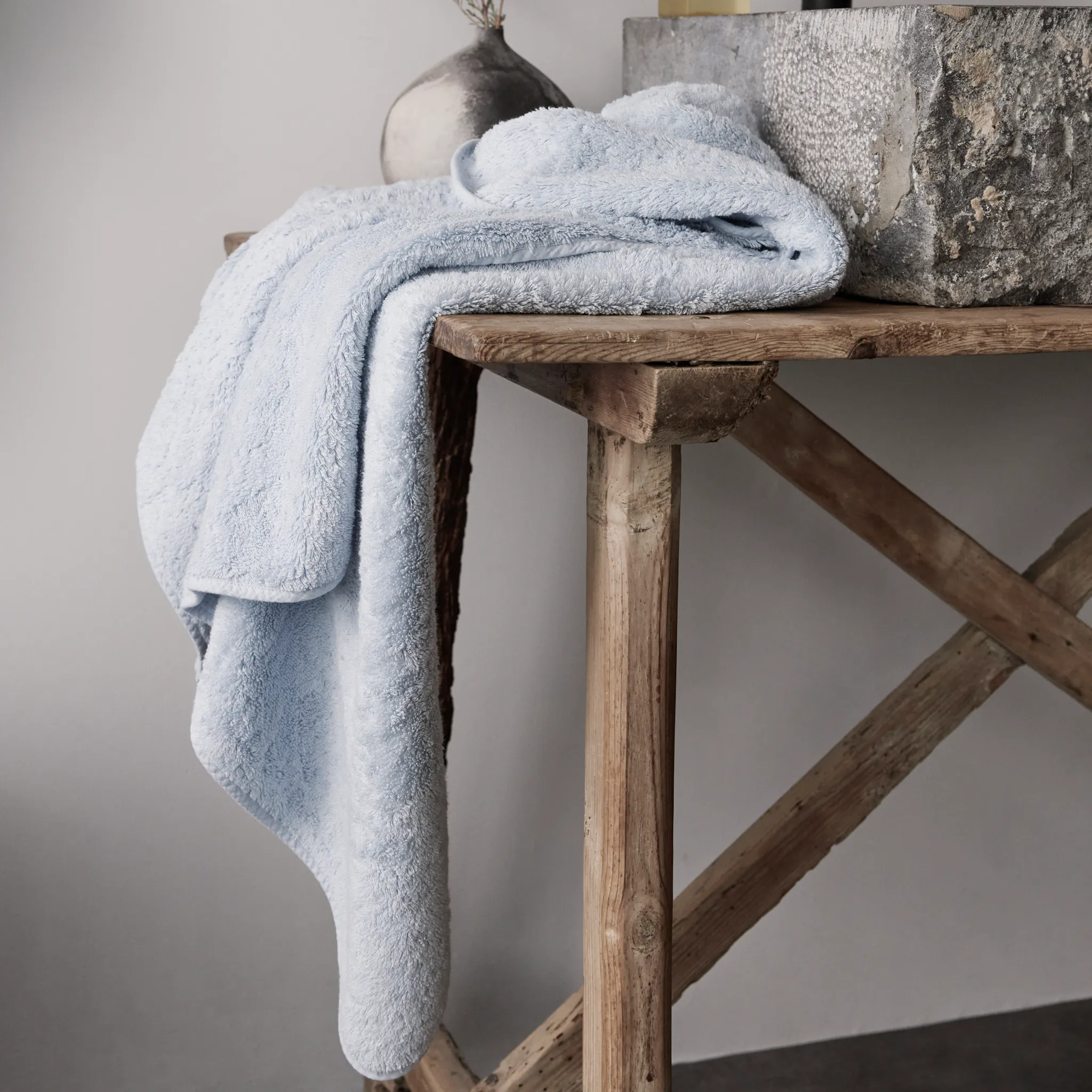
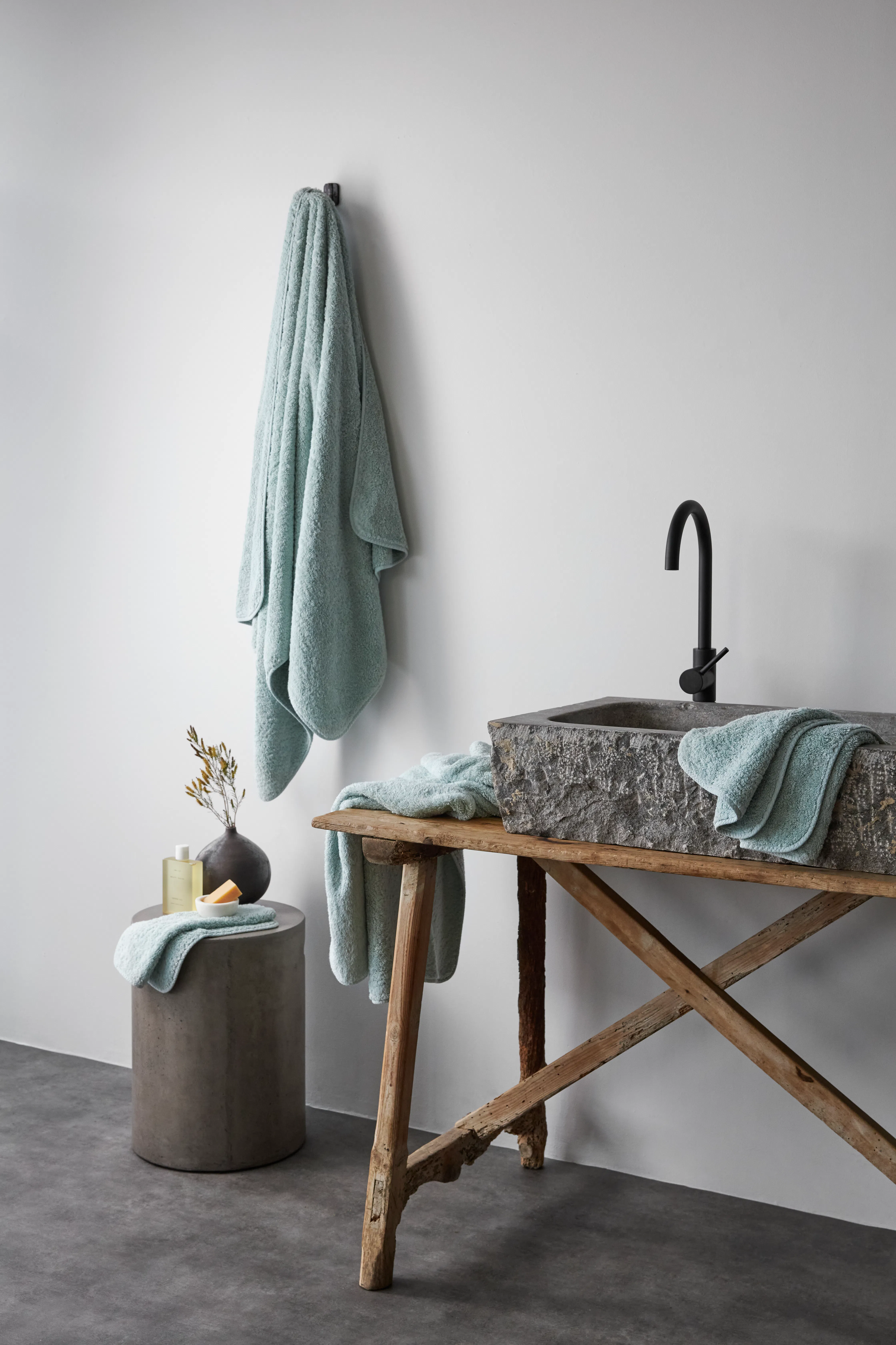
Even small interventions matter. A sage green towel. A seafoam bath mat. A soft olive robe hanging on the back of a door. These aren't just aesthetic choices. They're environmental cues, working quietly in the background every time you see them.
The Role of Your Bathrobe
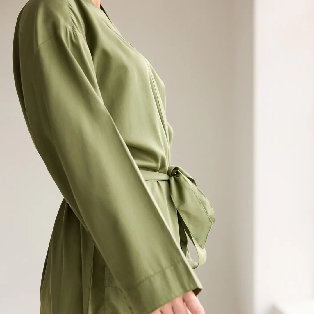
There's something particular about a bathrobe. Unlike linen or towels, it travels with you - from the bathroom to the bedroom, from the morning to the evening. It's the one piece of your reset ritual that stays closest to you.
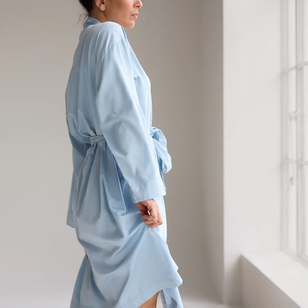
The colour and texture of a robe matters more than we tend to think. A robe in a calming tone - soft sage, warm seafoam, quiet sky - extends the reset beyond the bathroom. It becomes a wearable signal to your nervous system that you're still in that in-between space, not yet back on, not yet fully in the demands of the day or the evening.
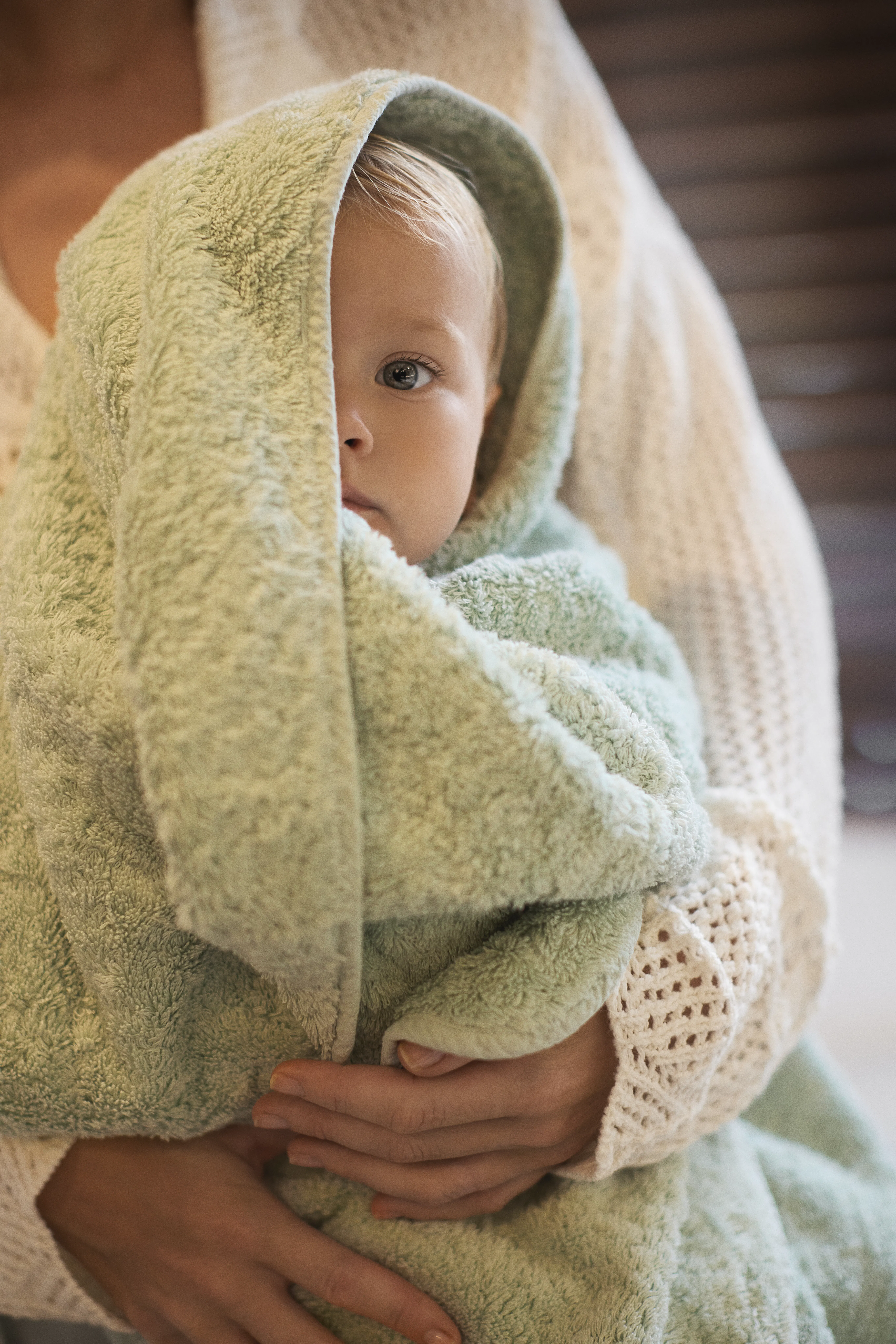
Pair that with a natural fabric - the weight and breathability of cotton, the softness of a well-made terry - and the sensory experience compounds. Texture amplifies colour. Together, they make the reset feel complete.
Colour and the Busy Life
For parents especially, the reset space is not a luxury. It's a necessity.
When you spend your day attuned to everyone else's needs - anticipating, responding, managing - your nervous system runs hot. The transition back to yourself doesn't happen automatically. It needs a cue. A ritual. An environment that signals, clearly and consistently, that this part of the day is different.
A calming colour palette is one of the most effortless ways to create that cue. You don't have to think about it. You don't have to remember to do it. You just walk into the room, and it begins.
That's the quiet power of colour done well. Not decorative. Functional. A space that works as hard as you do, in the moments when you need it most.
Building Your Calming Palette
If you're ready to bring more intention to your reset spaces, here's where to start:
Lead with green.
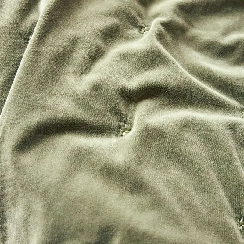
Sage and soft olive are the most grounding of the calming tones - rooted in nature, warm enough to feel welcoming, cool enough to slow you down. Start here and build outward.
Introduce water tones.
Seafoam and sky blue add a sense of openness and flow. Use them in textiles - towels, bath mats, robes - where they'll be seen and touched regularly.
Keep it muted.
Bright, saturated versions of these colours lose their calming quality. Look for tones that feel like they've been softened by light - dusty, quiet, unhurried.
Layer texture.
Natural fibres carry these colours beautifully. Cotton towelling, linen, soft jersey - materials that feel as good as they look, and add a tactile dimension to the colour story.
Less is more.
A calming space is also a considered one. A few well-chosen pieces in the right tones will do more than a room full of competing colours and patterns.
Two Palettes, One Home
A home that helps you live well tends to move between two modes: the warmth of winding down and the clarity of resetting. Our Sundrenched Colours - clay, port, mustard, warm olive - are for the first. Our Calming Colours - sage, seafoam, sky, soft olive - are for the second.
Used together across different spaces, they create a home that actively supports the rhythm of your day. Not just beautiful to look at, but genuinely responsive to how you feel.