Why Your Bedroom Colour Affects How Well You Unwind
There's a reason you feel instantly calmer walking into certain rooms. Or why some bedrooms feel like a genuine retreat while others just feel like a place to sleep. It's not always about the furniture, the tidiness, or even the light. Often, it comes down to colour.
The shades you surround yourself with at the end of the day have a measurable effect on your nervous system, your ability to wind down, and ultimately, how well you sleep. Here's the science behind it, and what it means for the way you dress your bed.

Your Brain Reads Colour Before You Do
Colour perception happens faster than conscious thought. Before you've registered that you've walked into a warm, amber-toned room, your brain has already begun processing it - adjusting your heart rate, your cortisol levels, your alertness. This is evolutionary, not aesthetic. For most of human history, colour was information: the red of danger, the green of safety, the golden warmth of late afternoon light signalling the end of the day.
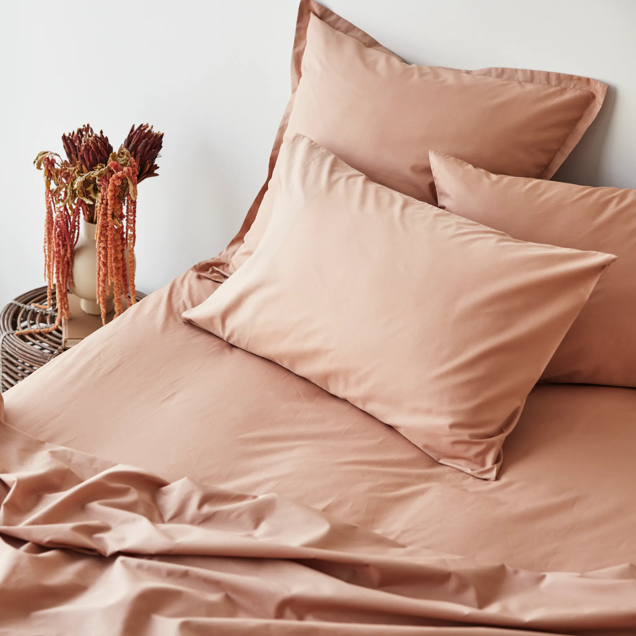
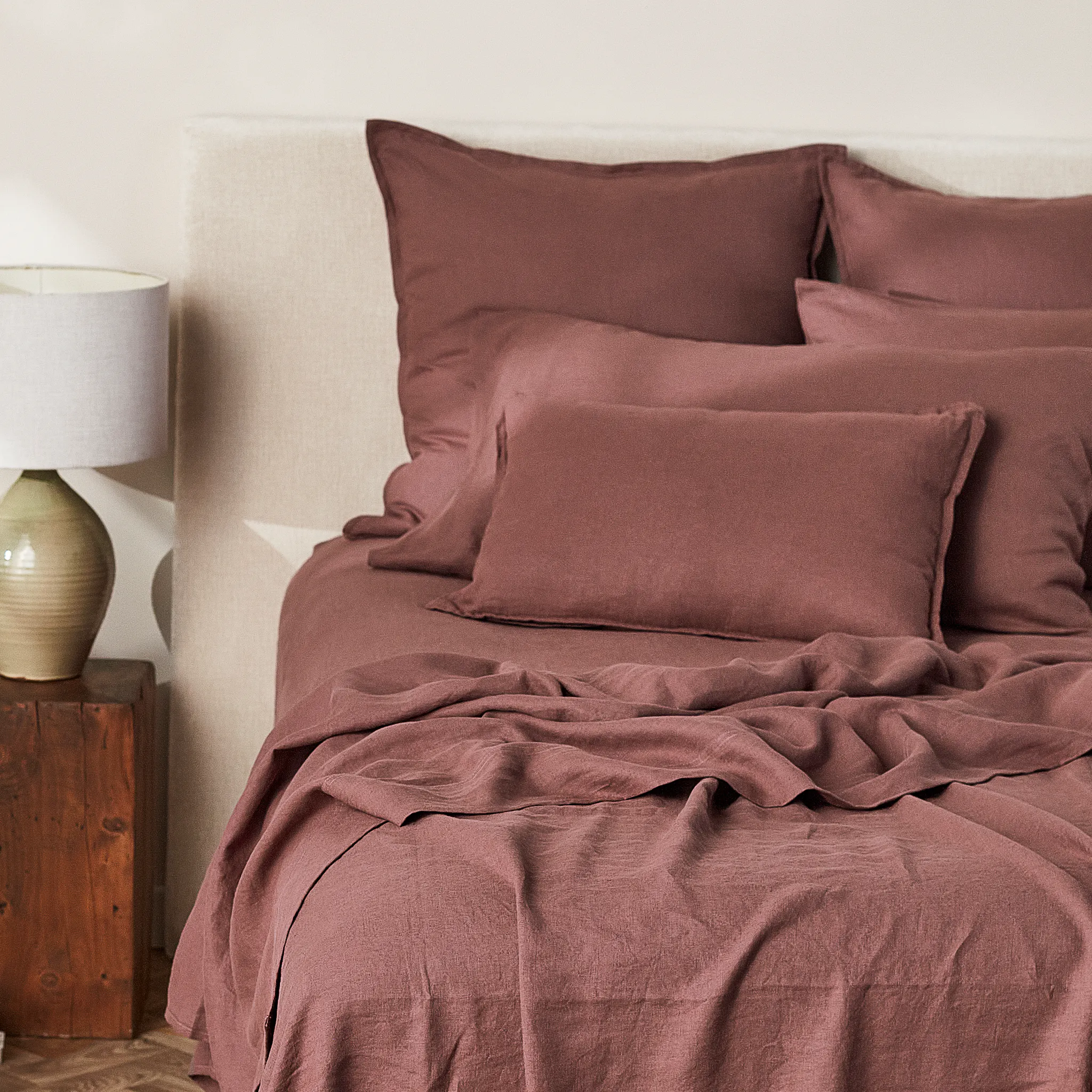
That last one is particularly relevant. The warm, low-saturation tones of dusk - the ambers, clay, mustard, and deep port of a sundrenched palette - are among the most ancient cues your body has for rest. When you surround yourself with them, you're not just making a design choice. You're speaking directly to your nervous system in a language it has understood for thousands of years.
The Science of Warm, Earthy Tones
Warm, desaturated colours - think clay, ochre, dusty mauve, deep olive - share a few qualities that make them particularly effective for unwinding.
They reduce visual stimulation.
High-contrast, highly saturated colours demand attention. Your eye is drawn to them, your brain stays alert. Muted, earthy tones do the opposite. They ask very little of your visual system, which gives your brain permission to slow down.
They mimic golden-hour light.
The colour temperature of late afternoon sun - warm, amber, low - is your body's oldest wind-down cue. It triggers the early stages of melatonin production, the hormone that prepares you for sleep. A bedroom dressed in these tones essentially extends that signal, even after the sun has set.
They create a sense of enclosure.
Deeper tones - port, charcoal, rich olive - have a cocooning quality. Rather than expanding a space visually, they draw it inward, creating a feeling of being held. For sleep, that sense of enclosure is deeply reassuring to the nervous system.
They connect us to nature.
Biophilic design research consistently shows that materials and colours referencing the natural world - earth, clay, dried grasses, warm stone - reduce stress markers and promote feelings of safety and calm. We are wired, quite literally, to feel at ease in these environments.
What Happens When You Get It Wrong
High-saturation colours - bright whites, sharp blues, vivid greens - are stimulating by design. They signal daylight, alertness, activity. In a workspace or kitchen, that's exactly what you want. In a bedroom, it works against you.
Similarly, high contrast - think very dark walls against very bright linen - keeps your visual system engaged. It's the same reason looking at a bright screen before bed disrupts sleep: contrast and brightness are wakefulness cues.
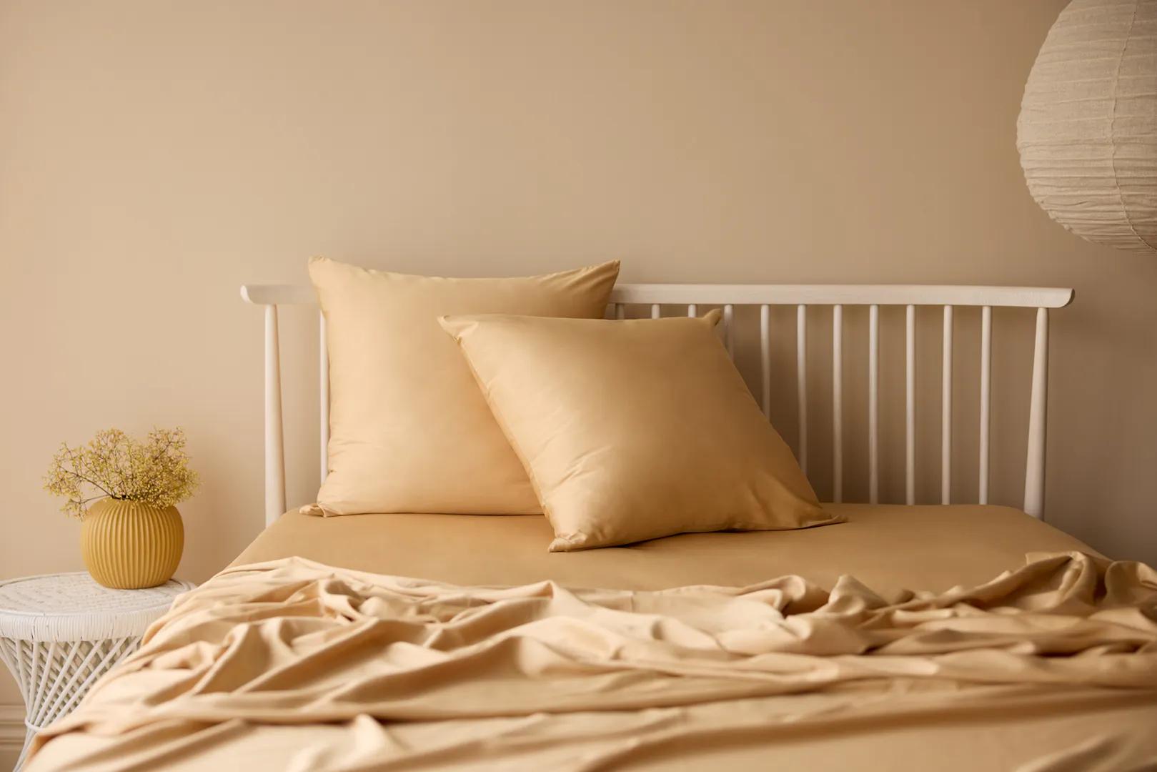
This doesn't mean your bedroom needs to be a neutral beige box. It means the palette should feel cohesive, warm, and low in visual tension. Colour working with you, not against you.
The Role of Texture
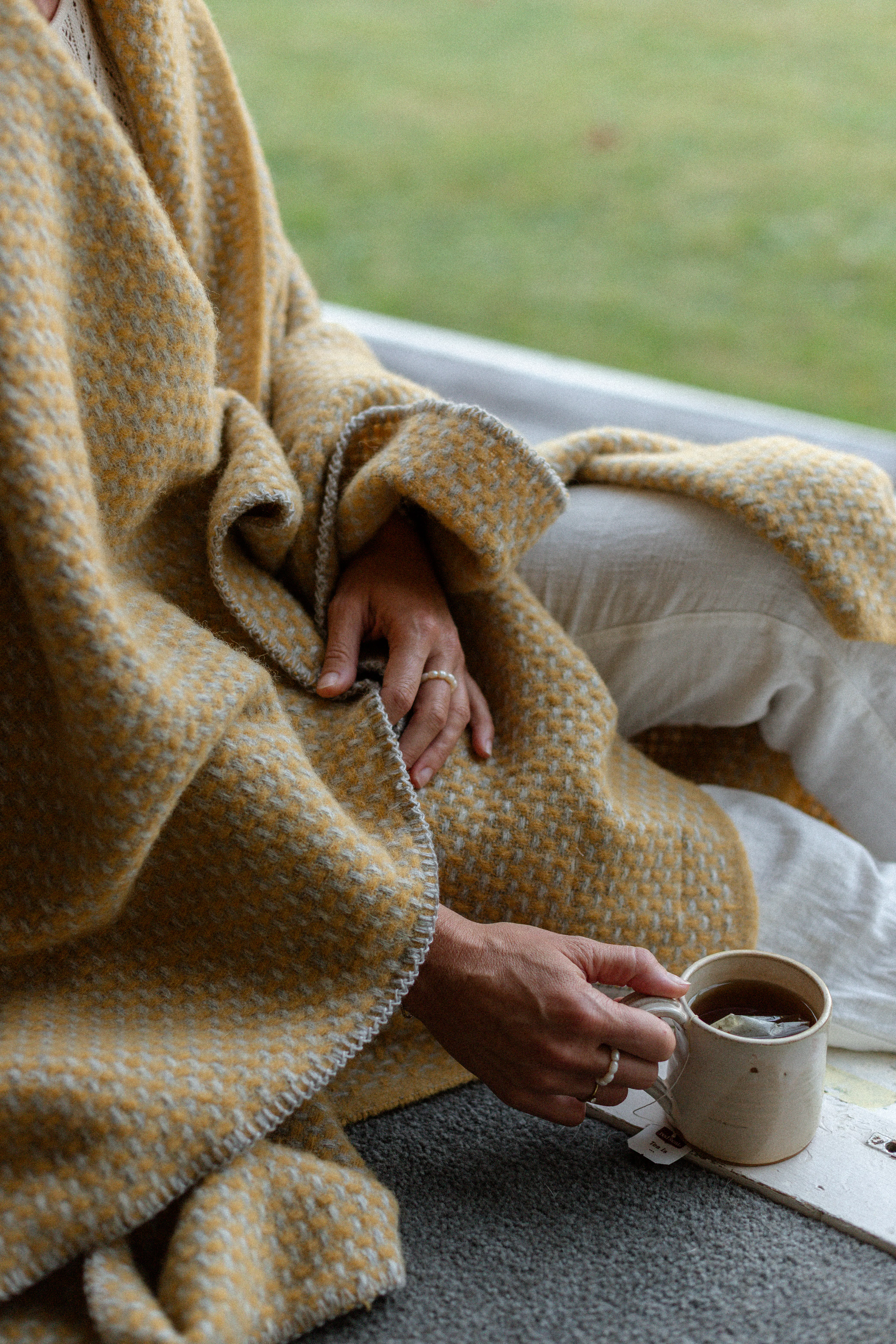
Colour doesn't work in isolation. The way a colour reads in a room is deeply influenced by the surface it sits on. A mustard linen pillowcase reads very differently to a mustard polyester one - softer, warmer, more organic. Texture adds depth to colour in a way that makes it feel alive rather than flat.
This is why natural fibres - linen, cotton, wool - amplify the calming effect of earthy palettes. The slight variation in weave, the way fabric catches light differently across its surface, the tactile invitation to touch - all of it adds to a sensory environment that signals rest. It's not just what you see. It's what the room feels like.
Building Your Unwind Palette
If you're thinking about how colour can work harder in your bedroom, here's where to start:
Anchor with warmth.
Choose a base tone in the warm spectrum - oat, clay, warm linen, soft sand. These tones are forgiving, versatile, and deeply restful.
Layer in depth.
Introduce one or two deeper, richer tones - a dusty port, a deep olive, a warm charcoal. These add visual interest without stimulation, and create that cocooning quality that makes a bedroom feel like a genuine retreat.
Keep saturation low.
The "dustier" or more muted the tone, the more restful it reads. Avoid anything that looks like it belongs on a feature wall in a cafe.
Let texture do the work.
Pair your palette with natural, tactile materials. Let the weave and weight of your linen carry the colour, rather than relying on pattern or contrast for interest.
Edit relentlessly.
A calm bedroom is also an uncluttered one. The fewer visual elements competing for attention, the more restful the space - colour included.
The Bedroom as a Ritual
Ultimately, the colours you choose for your bedroom are part of a broader ritual of unwinding. The act of making a bed beautifully, of choosing linen in tones that feel considered and calm, of creating a space that looks different from the rest of your home - these are small but meaningful signals to your brain that this room is different. That what happens here is different.
Sleep researchers call this "stimulus control" - the practice of training your brain to associate your bedroom with rest rather than activity. Colour is one of the most powerful tools you have for doing exactly that.
So the next time you're choosing a pillowcase or a new duvet cover, know that you're not just making a design decision. You're curating the environment your nervous system will use to decompress, restore, and prepare for tomorrow.